
2022. 11. 2. 13:50ㆍ회원작품 | Projects/Office
Silhouette of connection

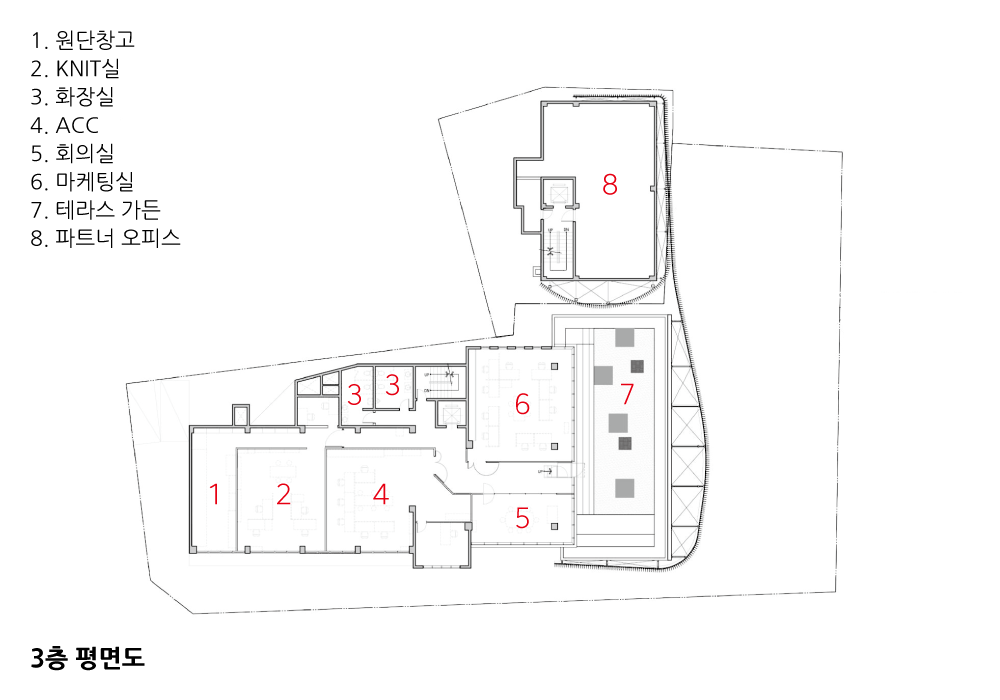
관계의 형태 / Silhouette of connection
1. 시간의 축적 : 클라이언트와 관계
1998년 패션디자이너 우영미 씨와 도산공원 앞 공사 중이던 사옥 자문으로 만났다. 패션회사 사옥으로 건축 외관에 대한 아쉬움을 토로하면서 자문을 구했었다. 원설계는 철저한 경제성에 입각한 구성이라, 디자인이 없었다. 그렇게 인연이 시작되면서 건축 외관을 디자인해 주었다.
그 뒤로 2012년 은퇴하고 여행을 떠나기 전까지 우영미 씨의 패션 브랜드 매장 전체를 디자인했다. 매해 토론하고 매장 인테리어의 방향을 설정하고, 콘셉트를 정하면서 연단위로 바꿔나갔다. 패션 브랜드는 언제나 새로워야 하는 운명을 갖고 있기 때문에, 매장을 방문하는 소비자들에게 새로운 공간 경험을 제공해야 했다. 다행히 우영미 씨와 디자인 소통이 잘 되어 매년 제안하는 디자인은 바로 반영되었다.
디자인 콘셉트는 매년 달리 정해졌다. 구축하는 형식에서 은유, 환영, 절곡 등등의 키워드로 디자인 코드가 결정되고 소재와 형태가 구성되었다.
클라이언트와 공간에 대한 소통과 공유는 디자인에 있어서 매우 중요한 가치와 과정을 상징한다. 더구나 장시간 교류는 서로 간의 이해 공유를 의미한다. 나 역시 우영미 씨의 디자인을 매년 관찰하고 이를 건축적 공간으로 해석하고 풀어나가는 노력을 했다.
디자인을 하는 과정에서 클라이언트에 대한 이해는 매우 중요하다. 상업공간은 목적이 아닌 도구로 제공되기 때문에 ‘어떠한 경험’을 소비자에게 전달하는 것은 ‘브랜드’ 전략이 되어야 한다. 상업공간을 디자인하는 것은 바로 브랜드 전략의 입체화이며 동시에 브랜드 경험을 만드는 것이어야 한다.
2. 아카이브
(1) 건축의 기록
아카이브는 시간의 연대기이며 흔적을 말하며 단어 자체가 개념적이다. 디자인의 출발은 아카이브라는 프로그램에서 시작했다. 그리고 수십 년을 신사동과 논현동, 삼성동을 기반으로 사업한 지리적 배경을 떠나서 구의동으로 이전한 새로운 장소에 정착은 또 다른 디자인 개념이었다.
SITE : 구의동 현장은 그 자체가 건축적 기록이며 아카이브의 흔적을 드러내는 흥미로운 대상이었다. 기존 건축은 끊임없이 리모델링 되면서 성형과 변형, 그리고 증축을 통해서 원형을 변형해왔다.
Archive : 기록은 시간을 바탕으로 한다. 그리고 기록은 증거를 남겨둔다. 키워드의 확장 : 기록시간―흔적―섞임―배어나옴―덮어버림―빛의 이동성으로 이어지는 키워드들은 본 프로젝트를 시작하면서 떠올랐던 단어들이다.
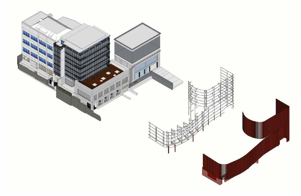
디자인해야 할 대상은 두 개의 필지에 두 개의 건물이었지만, 건축 형태적으로는 세 개의 분리된 매스로 구성되어 있었다. 여러 가지 생각을 하다가 전체 건물들 보자기로 싸듯이 크게 덮어보기로 했다. 속에 어떤 것이 있을지 모르는 상상력의 보자기보다는 어느 정도 호기심을 자극하는 어슷한 외장재와 형태를 찾기 시작했다. 여러 의논 끝에 수직 루버로 구성하기로 하고 건물 철거를 시작했다. 어색하게 각각의 형태를 덮고 있는 덮개를 걷어내고, 외장인 골강판을 걷어내기로 했다. 외장을 걷어내기 시작하자, 흥미진진하게도 전혀 다른 새로운 입면들이 등장하기 시작했다. 그렇게 드러나는 외벽은 내피들은 연도별로 다른 재질과 색을 드러냈다.
(2) 이동과 시점에 따른 이중 외피
A. 시점
숨겨진 건축 원형을 드러내는 것은 40년의 패션 디자이너 아카이브를 읽는 것과 같다.
B. 이중외피
평면적으로 기존 건물들은 도로에 다양한 위치에 서 있다. 이런 관계의 형태를 물흐르듯 흐르는 곡선으로 만들어 냈다.
C. 루버
수직 루버는 깊이와 사선의 단면을 가지면서 전체 형태를 강하게 왜곡하며, 빛에 따라 다른 느낌을 전달해준다.
D. 덧붙임
다양한 거리를 갖고 덧붙여진 루버는 기존의 형태를 알 수 없게 만든다. 이런 모호성은 패션의 변화와도 맞물려 있다. 하나로 정의하기 어려운 순간의 결과물을 은유한다.
3. Shape vs Form
따로 계획된 두 개의 건물은 시간이 지나면서 여러 건물주에 의해 리모델링되고, 형태 변형이 있었다. 세월이 지나 한 명의 소유주가 통합하게 된 상황에서 건축 디자인은 보자기처럼 전체를 아우르는 것이어야 했다. 대지와 도로에 면한 형태들의 불규칙적 면들을 시간과 공간의 흐름을 엮어내듯 유선형으로 덮어야 했다.
# 1. 2001년 클라이언트와 과천에 개인 미술관을 계획했었다. 리처드 세라를 좋아하는 입장에서 과천의 대지를 보자마자 떠올린 형태가 있었다. 대지에 내려앉은 거대한 곡면의 형태로 제안했고, 클라이언트가 정말 좋아했다.
# 2. 알레 갤러리의 50미터 벽_ 어슷한 곡면의 벽은 경계의 상징이다. 건축의 외벽이라는 기능도 있었지만, 전혀 다른 세상으로 구분하는 영역의 개념이 더 강했다.
# Shape vs Form
구의동 사옥의 리모델링 디자인을 하면서 22년 전의 모호한 곡면이 떠올랐다. 기존 건물의 구성은 다소 임의적이고 개별적인 각각의 형태였고, 소유주 또한 달랐다. 이를 하나로 통합하는 모양으로 구성하는 디자인이 필요했고, 자연스럽게 배치적으로 어긋나 있는 것을 감싸는 유선형이 나오게 되었다. 다만, 감싸는 형태에 대한 고민이 시작되었다.
로드맵을 통해서 시간을 거슬러 과거의 모습에서 디자인 방향성을 찾아보다가 생각보다 여러 번 건물의 외장과 형태가 바뀌었음을 알게 되었다. 이런 변화는 도시와 건축에 있어서 시간의 흔적을 드러내기에 안성맞춤이었고, 물리적으로 확실한 형태(Form)를 가진 것보다는 어슷한 모양새(Shape)로 형태를 만들어가야 한다는 생각이 들었다. 면적증감의 실을 증축하는 것이 아니라, 흩어져 있는 각각의 덩어리들을 엮어내는 하나의 통합이미지를 구성하면서도 각각의 존재를 암시하는 은유적인 구성으로 결정했다. 선택된 방식은 루버를 통한 기존 모습의 암시였고, 기존 건물과 루버의 간격 차이는 빛에 따라 각기 다른 구성으로 펼쳐지는 그림자의 변화를 읽게 했다. 오히려 매력적인 다이내믹함으로 표현되었다.
4. Green & Archive
Archive _ past & future
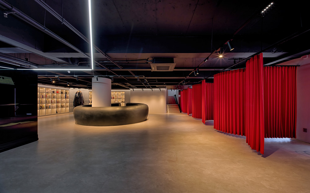
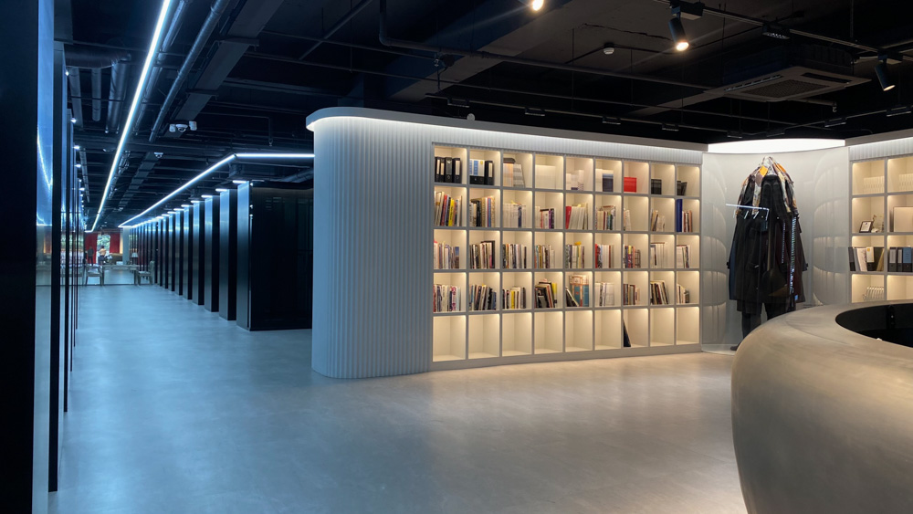
건축형태를 구성할 때 시각적 착시와 왜곡은 공간의 깊이와 구성을 흥미롭게 전개시킨다. 본 프로젝트 외관을 구성하는 거대한 붉은색 루버 역시 시각적 착시와 왜곡을 동원했고, 다양한 이야기를 만들어 냈다. 이런 생각의 연속적 측면에서 우영미 씨의 40년 패션 디자인 활동을 적층시켜 보여주는 패션 라이브러리 구성을 했으며, 그 확장의 과장을 보여주기 위한 축을 내부에 시공했다. 그리고 그 끝점에 거울을 설치해서 지나간 40년만큼 앞으로의 시각을 극대화하는 무한대의 이미지를 구성했다.
Red
1998년 처음 조우한 우영미 씨는 붉은색을 선호하지 않았다. 하지만 시간이 흘러 이번 프로젝트에서 가장 강력한 컬러 선택의 지지자가 되었다. 심지어 그녀의 프로젝트에 우영미의 레드를 만들어 사용하고 진행했다. 어쩌면 ‘Red’의 다양한 은유와 함의적 내용들이 40년 패션디자이너의 에너지를 자극했는지도 모르겠다. 그렇게 건축과 내부에 사용된 ‘Red’는 수차례 샘플링을 했고, 그 안에서 선택했다. 특히 건축 외장에 사용된 메탈릭 레드(Metalic Red)는 시시각각 변화하는 태양빛에 의해 매번 다른 감정의 색을 드러내었다. 건축과 인테리어 전체에 사용된 무채색들은 Red를 지원하는 서포터 컬라이며, 질감 역시 신중하게 선택되었다. 매끈한 금속의 붉은 루버는 거친 아스팔트와 콘크리트를 딛고 사용되었다. 러프한 질감의 붉은 커튼은 중간질감의 실내 소재들과 사용되고 있다.
조연의 먹색 달 항아리 : 실내의 중심에는 먹색 원형의 카운터를 구성했다. 건축 외피의 셰이프(Shape) 연장선이기도 하지만, 천의 특성인 ‘흐르는’ 느낌을 의도한 것이기도 하다.
Garden & Green, With Design Allee
두 개의 대지에 배치된 건물은 여백을 가지고 있는데, 여백의 틈을 채우고 있는 것은 녹색의 자연들이었다. 본 프로젝트에서 조경을 담당한 알레 우현미 소장은 인공적 자연보다는 원초적인 숲속의 자연을 모티브로 이런 여백의 틈을 구성했다. 다만, 공간의 한계에 대한 극복으로, 조경공간에 거울을 두고 확장감을 의도하고 왜곡해서 사용했다.
틈 사이의 그린은 레드와 무채색의 건축적 인공성 사이에 자리 잡아 예측 불가능의 변화로 이어지도록 했고, 작은 이야기의 유니크함은 선이 강조된 형형색색의 가구로 배치해서 전체 디자인을 완성했다.

Silhouette of connection
1. Timeline: Relationships with Clients
I met fashion designer Youngmi Woo in 1998 as an advisor to the HQ building which was under construction in front of Dosan Park. She had sought for advice while expressing her dissatisfaction of the fashion company's HQ building appearance. Since the original design was a composed based on thorough economic feasibility there was no design. As the relationship began, I designed the exterior of the building.
After that I designed the entire store for Youngmi Woo's fashion brand until I retired in 2012 and went on a trip. Every year, we discussed, set the direction of the store interior, decided on a concepts and changed it year by year. Because fashion brands have always had to be new, a new spatial experience is felt necessary for consumers who visit the store. It is very fortunate that the design communication with Youngmi Woo was good, allowing designs which were proposed every year immediately reflected.
The design concept is set differently every year. In the process of building form the design code was established with keywords such as metaphor, illusion, and bending, as well as the material and form were composed.
Communication and sharing with clients and spaces symbolizes very important values and processes in design. Moreover long-term exchanges mean mutual understanding. I also observed Youngmi Woo's designs every year and tried to interpret and solve them as architectural spaces.
In the process of designing, understanding of client is very important, and since commercial space is also serves as a tool rather than a purpose, delivering an ‘experience’ to consumers should be a ‘brand’ strategy. Designing a commercial space should be the three-dimensionalization of the brand strategy and at the same time creating a brand experience.
2. Archive
(1) Records of construction
Archive is a chronology of time, a trace, and the word itself is conceptual. Design is started with a program called Archive. In addition, regardless of the geographical background of business which is based on Sinsa-dong, Nonhyeon-dong, and Samseong-dong for decades, settling in a new place that was relocated to Guui-dong was another design concept.
SITE: The Guui-dong site itself is an architectural record and an interesting object that reveals the traces of the archive. Existing architecture has been constantly remodeled and transformed from its original form through extension.
Archive: Records are based on time. And records leave evidence. Expansion of Keywords: Record―Time―Traces―Mixing―Seeping―Overlaying―The keywords leading to the mobility of light are the words that came to mind when the project began.
The object to be designed was two buildings on two lots, but in terms of architecture forms, it was composed of three separate masses. After thinking about various things, I decided to cover the entire building with a cloth. Rather than imagining what might be inside, I started looking for similar exterior materials and shapes that stimulate curiosity to some extent. After several discussions, I decided to construct a vertical louver and started demolition of the building. I decided to take off the cover that covers each shape awkwardly and remove the corrugated steel plate as the exterior. Interestingly, as the exterior began to be removed, completely different new facades began to appear. The outer wall revealed that the inner skin showed different materials and colors from year to year.
(2) Double skin according to movement and point of view
A. Point of View
Revealing hidden architectural archetypes is like reading a 40-year archive of fashion designers.
B. Double Skin
In terms of plan, the existing buildings stand in various positions on the road. This relationship is shaped like a flowing curve.
C. Vertical Louver
The vertical louver strongly distorts the overall shape while having a cross section of depth and diagonal lines, and conveys a different feeling depending on the light.
D. Patch
The louvers that are added with various distances make the existing shape unknown. This ambiguity is also connected with the change of fashion. It is a metaphor for the outcome of a moment that is difficult to define as one.
3. Shape vs Form
The two separately planned buildings were remodeled by several owners over time and there was a change in shape. As it is an integration and unification over the years the architectural design, it has to embrace the whole like a wrapping cloth. The irregular faces of the forms facing the land and the road had to be covered with a streamline as if weaving the flow of time and space.
# 1. In 2001, I planned a private art gallery in Gwacheon with a client. As i admired Richard Sera;s works, there was a form that came to mind as soon as I saw the land of Gwacheon. I proposed it to be in the form of a huge curved surface that landed on the ground, and the client liked it very much.
# 2. The 50-meter wall in Allee Gallery_ The wall with a similar curved surface symbolizes boundaries. Although it had the function of an exterior wall of architecture, the concept of a domain that separates it into a completely different world was stronger.
# Shape vs Form
While designing the remodeling of the HQ building in Guui-dong, an ambiguous surface from 22 years ago came to mind. The composition of the existing building was rather arbitrary, individual and the owners were also different. It was necessary to design a design which integrates these situations into one and a streamlined shape that naturally wraps up the displaced elements came out. However concerns about the wrapping form began.
By using Daum road-view, looking back in time and looking for the design direction in the past, I found that the exterior and shape of the building had changed more than I expected. This change was perfect for revealing the traces of time in the city and architecture, and I thought that it should be made with a similar shape rather than a physically definite form. Rather than extending the thread of area increase or decrease, it was decided to construct a single integrated image that weaves each scattered mass, while metaphorically suggesting the existence of each. The chosen method was an allusion to the existing appearance through the vertical louvers and the difference in the gap between the existing building and the vertical louvers made it possible to read the change in the shadows unfolding in different compositions depending on the light. Rather, it was expressed with attractive dynamics.
4. Green & Archive
Archive _ past & future
When composing an architectural form, visual optical illusions and distortions develop the depth and composition of the space in an interesting way. The huge red louvers that make up the exterior of this project also mobilized visual illusions and distortions, creating a variety of stories. In the continuous aspect of this thought, a fashion library was constructed to show the layers of Youngmi Woo's 40 years of fashion design activities, and an axis was built inside to show the exaggeration of its expansion. Furthermore by installing a mirror at the end point, an infinite image was created that maximizes the future vision as much as 40 years have passed.
Red
Youngmi Woo, whom I first met in 1998, did not have a preference for red. She did, however, as time went on became a supporter of the most powerful collar choice for this project. She even made and used Youngmi Woo's red for her projects, and she worked on it. Perhaps the various metaphors and connotations of ‘Red’ stimulated the energy of a fashion designer for 40 years. ‘Red’ used in the architecture and interior was sampled several times and few among it were selected. In particular, Metalic Red used for the exterior of the building revealed a different emotional color each time by the ever-changing sunlight. The achromatic colors used throughout the architecture and interior are supporter colors that support Red, and the texture is also carefully selected. The smooth metal red louver was used over rough asphalt and concrete. The red curtain with a rough texture is used with interior materials with a medium texture.
Black Moon Jar of Supporting Smoke: In the center of the interior, an ink-colored circular counter is built. It is an extension of the shape of the building envelope, but it is also intended to give the feeling of ‘flowing’, which is characteristic of the fabric.
Garden & Green, With Design Allee
The building placed on the two sites has a vacant space, and it is the green of nature that fills the blank space. Alle Hyunmi Woo, who was in charge of the landscaping in this project, created this gap in the blank with the motive of primitive nature in the forest rather than artificial nature. However, to overcome the limitations of space, she placed a mirror in the landscape space and used it intentionally distorting the sense of expansion.
The green between the gaps is positioned between the red and the achromatic architectural artificiality, leading to unpredictable changes, and the uniqueness of the small story is arranged with colorful furniture emphasizing the lines to complete the overall design.


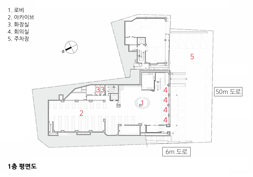

| WYM 아카이브 사옥 리노베이션 설계자 | 홍성용 _ 건축사사무소 NCS Lab 건축주 | WYM _ 주.쏠리드 감리자 | 홍성용 _ 건축사사무소 NCS lab 시공사 | 주.아름다운 창호[구조] + 주.커윈[마감] 설계팀 | 이바다, 이은지, 이재윤 대지위치 | 서울특별시 광진구 구의동 58-15, 16 주요용도 | 업무시설 대지면적 | 293.1㎡ / 1,357.6㎡ 건축면적 | 169.85㎡ / 578.43㎡ 연면적 | 855.81㎡ / 3,037.35㎡ 건폐율 | 57.95% / 72.61% 용적률 | 198.20% / 158.39% 규모 | B2F - 5F 구조 | 철근콘크리트+철골 외부마감재 | 투명 로이 복층유리, 알루미늄 루버 내부마감재 | LVT 타일, 템바보드 위 도장, 노출 콘크리트 설계기간 | 2021. 09 - 2022. 01 공사기간 | 2021. 12 - 2022. 05 사진 | 김용순, 홍성용 구조분야 : 박용좌 _ 주.지우이앤아이 조경분야 : 디자인알레 |
Silhouette of connection Architect | Hong, Sung Yong _ NCS Lab Architects Client | WYM _ Solid Co., Ltd. Supervisor | Hong, Sung Yong _ NCS Lab Architects Construction | Beautiful Window Co., Ltd. + Kerwin Co., Ltd. Project team | Lee, Ba Da / Lee, Eun Ji / Lee, Jaeyun Location | 58-15,16, Gui-dong, Gwangjin-gu, Seoul, Korea Program | Business Facilities Site area | 293.1㎡ / 1,357.6㎡ Building area | 169.85㎡ / 578.43㎡ Gross floor area | 855.81㎡ / 3,037.35㎡ Building to land ratio | 57.95% / 72.61% Floor area ratio | 198.20% / 158.39% Building scope | B2F - 5F Structure | RC+Steel Exterior finishing | Low-E double-decker glass, Aluminum Louver Interior finishing | LVT tile, Paint finish above Tembar board, Expose concrete Design period | Sep. 2021 - Jan. 2022 Construction period | Dec. 2021 - May 2022 Photograph | Kim, Yongsoon / Hong, Sung Yong Structural engineer | Park, Yongjwa _ Zywoo EnI Landscape engineer | Design Allee |
'회원작품 | Projects > Office' 카테고리의 다른 글
| 퀸즈파크나인 2018.10 (0) | 2022.12.08 |
|---|---|
| 런커사옥 2018.08 (0) | 2022.12.06 |
| 역삼동 현성빌딩 2018.08 (0) | 2022.12.06 |
| JYA HOME 2022.10 (0) | 2022.11.02 |
| 잔카 드림타워 지식산업센터 2022.10 (0) | 2022.11.02 |